The Space Between the Light: Meet the Designers Who Sculpt Rooms Out of Shadow
Walk into most beautifully designed rooms and your eye goes straight to what's glowing — the statement pendant, the backlit shelving, the warm wash of a well-placed sconce. That's the instinct most of us have, and honestly, most designers share it. Light is the hero. Shadow is just what happens when the hero shows up.
But a small, quietly passionate community of American designers is flipping that script entirely. For them, shadow isn't the residue of illumination. It's the whole point.
Darkness as Design Material
Chicago-based interior architect Renata Sousa has been designing what she calls "shadow-forward" spaces for about eight years. Her portfolio reads like a study in restraint — hotel lobbies that feel like they're exhaling, private residences where certain corners seem to pull you inward without explanation, restaurant spaces that somehow feel both dramatic and deeply calm.
"Most designers think about where the light goes," she says. "I spend most of my time thinking about where it stops."
Sousa's process starts not with a lighting plan but with what she calls a "shadow map" — a rough sketch of where she wants darkness to pool, gather, or move across a surface as the day changes. Fixtures come later, chosen specifically to produce the shadows she's already designed around.
It sounds counterintuitive. It looks, when done well, like magic.
The Japanese Concept That's Reshaping American Interiors
The philosophical backbone of this movement isn't new. Designers working in this space almost universally reference two concepts that have been quietly influential for decades but are now getting serious mainstream traction.
The first is ma — a Japanese term that translates roughly to "negative space" or "the pause between." In architecture and design, ma refers to the intentional emptiness that gives meaning to what surrounds it. It's the silence between notes that makes music work. Applied to interior light, it's the shadowed alcove that makes the lit surface next to it feel more luminous, more alive.
The second is chiaroscuro — the Italian Renaissance painting technique of using sharp contrasts between light and dark to create depth, volume, and emotional weight. Caravaggio built entire narratives out of it. Now designers like Sousa are pulling it off the canvas and into three-dimensional space.
"Americans are starting to get comfortable with the idea that a room doesn't have to be evenly lit to feel good," says Portland, Oregon-based designer Marcus Weil, whose firm specializes in what he describes as "emotionally calibrated lighting environments." "In fact, even lighting is often the enemy of atmosphere."
Weil points to the open-concept, flood-lit interiors that dominated American home design through the 2000s and 2010s as a kind of cultural overcorrection — a fear of shadow that produced spaces that were, paradoxically, visually exhausting.
What a Shadow-First Room Actually Feels Like
Describing the experience of a well-executed shadow-forward space is genuinely tricky, which is part of why the discipline has been slow to gain mainstream recognition. It doesn't photograph the way a bright, airy room does. It doesn't translate easily to an Instagram grid or a Pinterest board.
But in person? It hits differently.
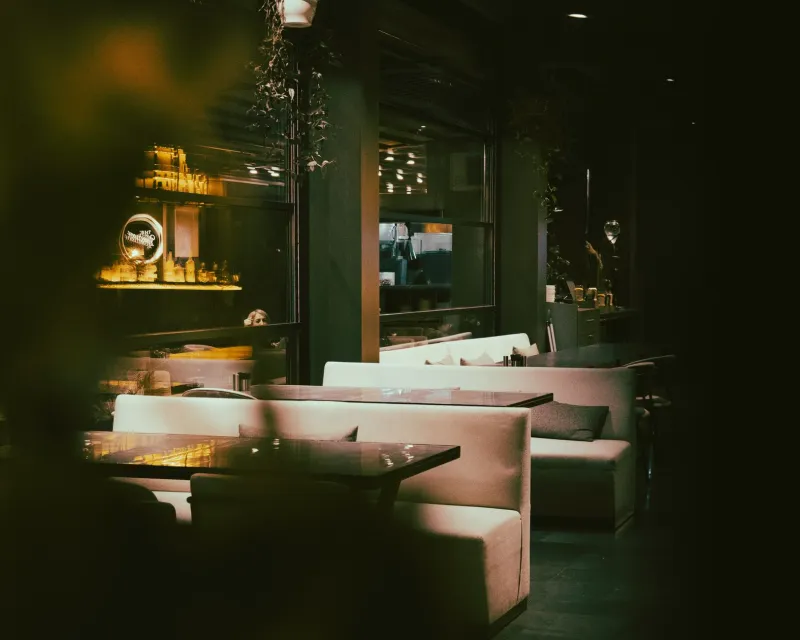
Sousa walks me through a hotel bar she recently completed in Nashville. The ceiling is high but feels intimate — because bands of deep shadow run across it at irregular intervals, breaking the space into what feel like smaller, warmer zones. The back wall is almost entirely in darkness except for a narrow strip of warm amber light that grazes across a textured plaster surface, making it look almost like something geological, ancient. You find yourself wanting to sit in the darker booths, not the brighter ones near the window.
"People always choose the shadow seating first," she says, smiling. "Every time."
The Tools of the Shadow Trade
So how do you actually build a room around darkness? The practitioners in this space describe a toolkit that's more about subtraction than addition.
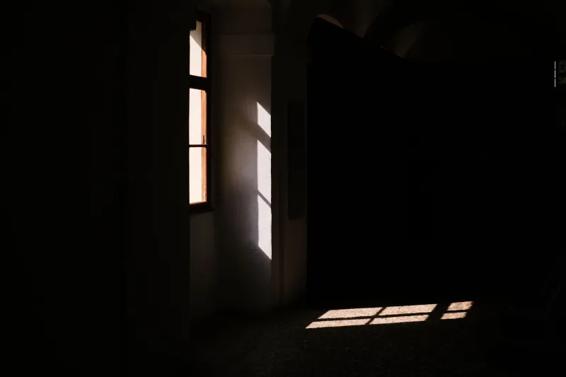
Louvered panels and slatted screens are popular — they cut light into ribbons, producing dramatic striped shadows that shift as the sun moves. Deeply recessed ceiling fixtures throw light downward without spilling it sideways, creating pools rather than floods. Matte, highly textured wall surfaces catch light at raking angles, producing micro-shadows that give flat walls genuine visual depth.
Weil is a particular fan of what he calls "directional starvation" — deliberately leaving entire walls or ceiling planes without any dedicated light source, forcing the eye to read them as shadow rather than surface. "You're not painting the wall dark," he explains. "You're letting the absence of light do that for you. It reads completely differently."
Natural light is also a major tool, arguably the most powerful one. New York-based architect Priya Chandrasekaran designs homes and commercial spaces where window placement is determined almost entirely by the shadows the openings will cast at different times of day. "A window isn't just a view," she says. "It's a shadow-making machine. Most people only think about one of those things."
Bringing Shadow Thinking Into Your Own Home
You don't need to commission a shadow architect to start applying some of this thinking at home. The practitioners we spoke with offered a handful of surprisingly accessible starting points.
Kill a few bulbs. Seriously. Weil recommends removing or switching off one or two light sources in your most-used room and living with it for a week. "Most people discover they don't miss the light. They miss the habit of turning it on."
Go directional. Swap out any overhead fixtures that throw light in all directions for something more focused — a directional spotlight, a task lamp angled at a wall, a floor lamp positioned to graze across a textured surface rather than illuminate the whole room. Watch what the shadows do.
Think about 9 p.m., not noon. Most of us design our homes for daytime functionality. But Sousa argues the evening hours are when shadow design really pays off. "Light a candle or two and look at your room," she suggests. "The shadows will tell you exactly what's missing."
Embrace the dark corner. Chandrasekaran's advice is simple: stop trying to light every corner of every room. "A shadowed corner isn't a failure. It's an invitation. It gives the eye somewhere to rest."
The Light You Don't Use
There's something almost meditative about the way these designers talk about their work. They're not anti-light — that would be absurd, given that light is the medium they're working with. But they've developed a deep respect for what light leaves behind, for the shapes and moods that only exist because illumination stopped somewhere.
At Illums, we talk a lot about light as art. These designers are making a compelling case that the art lives just as much in the negative space — in the carefully considered places where light simply doesn't go.
The shadow, it turns out, has been waiting for its moment. And it's getting pretty good at stealing the show.